In Living Color
- Dec 31, 2025
- 4 min read
Over the last few months we have discussed the elements of graphic design and what it takes to build a successful piece of visual communication - strong typography, visual hierarchy, and C.R.A.P. Contrast, Repetition, Alignment, and Proximity. We are going to end 2025, the inaugural year of Off the Grid, by discussing color. You may be wondering why I left color for the end. Often times in the design process color is implemented into your design in the ending stages. After you have outlined your objective of the project, conducted your research, developed a mood board, chosen your typography, established successful hierarchy, you are then ready to add color to bring your work to life.
Now, I will admit, the design process that I've just mentioned does not always occur in this exact order in the real world. You may know the colors you are meant to use before you even know what the copy will be. For example, when working at the Savannah College of Art and Design (SCAD) I was often given a piece of artwork or imagery that would become the center of my design - a HERO image as we call it in the biz. A color would often be chosen for me by the client or, sometimes, I could choose a color that would compliment the HERO image.

Another example would be designing for a brand, such ORAFOL Americas. At ORAFOL, I have a style guide that I follow. A style guide, sometimes referred to as a brand guide, outlines everything I need to know about the brand - approved typography pairings, color palettes, photography style, web design elements... the list goes on and on. A style guide can be as detailed as a company would like it to be. This is very helpful for you, the designer, as you visually communicate the brand.

Pro Tip: If you are given a style guide, study it. Know it like the back of your hand. The better you know the style guide the more opportunity you have to expand on it and keep the brand fresh in the eyes of your target audience.
But what happens when you aren't given a color direction and you don't have a style guide to guide you? I always say, design in black and white first and then add color at the end. If your design works in black and white then it will also work in color. This is especially true for logo design.
When you're ready to incorporate color think about those initial questions we discussed in the Typography Matters post:
What is the project's objective?
Is there a theme? A milestone birthday invitation, a destination brochure, a concert poster
Who is your intended audience? Age, geographic location
Where will the project be viewed? Print, on a screen, large format, small format
The answers to these questions will tell you a lot about the direction you need to go in when choosing colors. Explore various hues, shades, tints, and tones to achieve the color you like and bring your work to life.
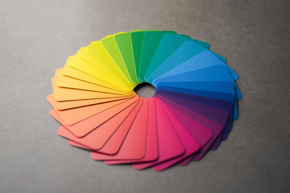
Hue - The pure, unmixed color as found on the color wheel.
i.e. red, yellow, blue, green
Shade - A hue mixed with black to make it darker or more intense.
i.e. a darker red, like maroon or burgundy
Tint - A hue mixed with white to make it lighter and softer.
i.e. pastels
Tone - A hue mixed with gray to reduce its intensity or vibrancy, making it less bright.
i.e. gray mixed with pink to create a softer salmon color
Digital color palettes have made this process easier than ever! Below are some of my favorite color palette resources:
What I love about Coolors is the site gives you a ton of trending ready to go color palettes to choose from. You can also copy the HEX code straight from the color palette, export the color palette and drop it into your project brief, and even visualize the colors in a design.

Adobe Color has similar features, as well as allowing you to extract color and gradient from an image and build a color palette from it. Remember the HERO image we talked about earlier? This is the perfect feature for just that. Adobe Color also offers contrast suggestions.

As we wrap up 2025, I want to thank you for joining me Off the Grid. It has been really fun connecting with all of you and discussing these topics out in the wild. I look forward to 2026 where we dive deeper into graphic design and all of the topics surrounding the practice. Have you ever heard of the Protestant Reformation? What does this 16th century religious movement have to do with graphic design? Stay tuned.
If you have a topic you would like to discuss or have a question about a project you're working on, drop me a line. I would love to chat!
"Adobe Color." Adobe Color, 1 Jan. 2025, color.adobe.com/. Accessed 31 Dec. 2025.
"Andy Brown." Unsplash, 23 May 2024, unsplash.com/photos/a-circle-of-different-colors-on-a-table-_jILcijLh_M. Accessed 31 Dec. 2025.
"Coolors.Co." Coolors, 1 Jan. 2025, coolors.co/. Accessed 31 Dec. 2025.


Comments