Typography Matters
- morganlchristopher
- Aug 21, 2025
- 5 min read
Updated: Aug 21, 2025
When you think about typography, what’s the first thing that comes to mind? In my experience, when I talk about typography, I am often met with the question, “Do you mean topography?” The two are often confused.
Merriam-Webster defines To-pog-ra-phy (noun) as the art or practice of graphic delineation in detail, usually on maps or charts of natural and man-made features of a place or region, especially in a way to show their relative positions and elevations.
Merriam-Webster defines Ty-pog-ra-phy (noun) as the style, arrangement, or appearance of typeset matter. However, this definition doesn’t quite encompass everything that typography actually is. Philip B. Meggs, author of Meggs’ History of Graphic Design (one of my favorite graphic design books EVER), defines typography as “the art and technique of arranging type to make written language legible, readable, and appealing when displayed.”
So…
TOPography is maps.
TYPography is letters.
That's settled.
Typography is my favorite aspect of graphic design. I love the letterforms, the different styles, and how typographic pairings can impact a design.

Fun Fact:
Letters being referred to as uppercase and lowercase dates back to the 15th century, originating from the days of the printing press. The metal characters were separated and stored in cases. The capital letters were stored in the upper part of the case, and the other characters were kept in the lower part of the case.
Graphic Design is the art of visual communication. When we think about visual communication, what does that mean? Everything we come into contact with communicates with us visually. For example, traffic signs along the highway, a brochure in the doctor’s office, operation hours on a shop door, even a website that we are attempting to access from our smartphone instead of a desktop, and it’s just not working.
Typography can make or break visual communication. As graphic designers, it’s our job to ensure the intended message is communicated effectively to the target audience. Without good typography, the message will be lost entirely.

When choosing a typeface for your next project, you want to consider a few things:
What is the project? A logo, brochure, poster, magazine article, web page
Is there a theme? A 60th birthday invitation, educational literature, corporate memo
Who is your intended audience? Age, geographic location, familiarity with the topic
Where will the project be viewed? In print, on a screen, large format like a billboard, small format like a business card
The answers to these questions will tell you a lot about the direction you need to go in when selecting your typefaces. The most important thing is legibility. When considering your audience, you want to make sure it can be recognized and read by the vast majority. If you’re designing a business card, you’ll want to choose a typeface that can be read at a small point size. If you’re designing a billboard, you’ll want to choose a typeface that can be read from a distance at 75 mph.
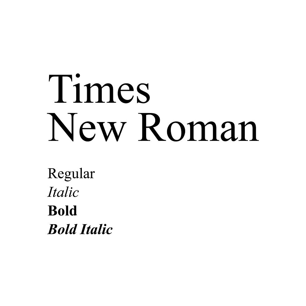
There are many different classifications of typefaces: serif, sans-serif, slab serif, script, mono, handwritten… the list goes on and on. The two main classifications I want to talk about here are serif and sans-serif. A serif typeface has, what I like to call, little feet at the end of each letter. You are probably most familiar with Times New Roman, a common serif that was the default font in Microsoft Word until 2007.
Fun Fact: Times New Roman was designed by Stanley Morison and Victor Lardent as a commission of The Times newspaper in 1931. Monotype, the world’s premier type design and engineering team, released Times New Roman in 1932.
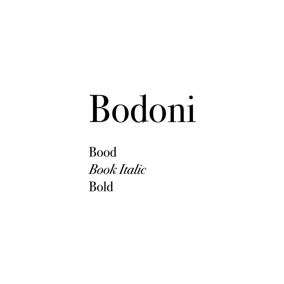
Bodoni is one of my favorite serif typefaces.
The word “sans” is French, meaning “without.” A sans-serif typeface is, you guessed it, a typeface without little feet at the end of each letter. You are probably most familiar with Helvetica, the default font on many Mac operating systems until 2016, when Apple introduced the San Francisco font. Many brands and organizations utilize Helvetica, including American Airlines, Jeep, and The North Face, to name a few.
Fun Fact: Helvetica was designed by Max Miedinger in collaboration with Eduard Hoffmann at the Haas Type Foundry in Switzerland in 1957.

Gotham is one of my favorite sans-serif typefaces.

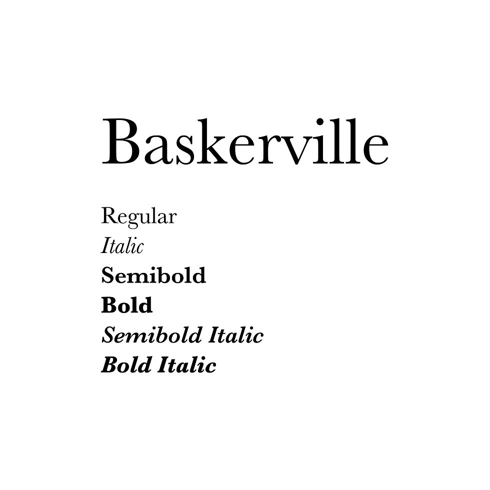
Another question I am often asked is, “What’s the difference between a typeface and a font?” This is a great question! A typeface is the overall design of each character. A font is the specific variation of that design. For example, Baskerville is a typeface. Baskerville Pro Bold is a font within the Baskerville typeface family.
I heard an analogy recently and I think it’s a good way to remember it: if a typeface were a clothing line, the font would be the different sizes available within the line.
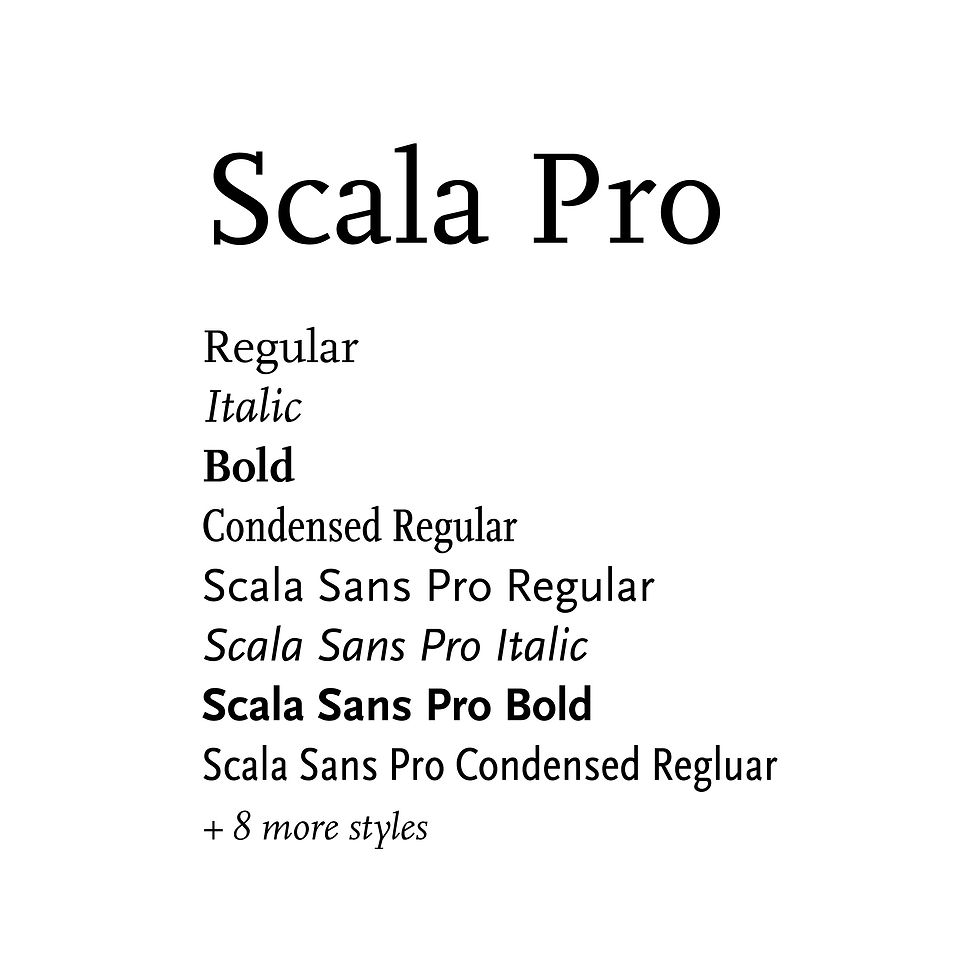
In the 16th century, printers organized roman and italic typefaces into matched families. This concept was formalized in the early 20th century. Traditional typefaces have small families, consisting of roman, italic, small caps, and maybe a bold or semibold. However, superfamilies also exist. A superfamily has dozens of fonts in multiple weights, widths, and sometimes in both serif and sans-serif. For example, Scala Pro is a superfamily.
We often see different typefaces paired together in one design. When pairing typefaces, remember, contrast is key. Contrast can be achieved in the sense of size, weight, or style. This is where the superfamily typefaces can really come in handy. A heading can be big and bold, while a subheading from the same family can be in italics or a thinner weight. This combination creates contrast while still having continuity within the design.

However, pairing fonts from different families is perfectly ok too, as long as the two successfully communicate the intended message (see preliminary questions above).

The anatomy of typography is also something to consider when pairing various typefaces. When mixing typefaces on the same line, it’s best practice to adjust the type size so the x-heights align more comfortably. The same goes for mixing typefaces on separate lines, it’s best practice to adjust the leading or type placement depending on the interaction of ascenders and descenders.

There are so many great resources available for learning more about typography. Here are a few of my favorite books and videos:
Books:
Thinking with Type by Ellen Lupton
Meggs History of Graphic Design by Philip B. Meggs and Alston W. Purvis
The Elements of Typographic Style by Robert Bringhurst
Videos:
As I've said, typography can make or break visual communication. Hierarchy is equally important. Join me next month as we talk about what it is and why we need it in design.
If you have a topic you would like me to cover or if you have a question about a project you’re working on, drop me a line. I would love to chat!
"Design Fails: 10 Times Typography Ruined The Day." Creative Market, 19 Apr. 2024, creativemarket.com/blog/design-fails-10-times-typography-ruined-the-day. Accessed 21 Aug. 2025.
Lupton, Ellen. Thinking with Type. 2nd ed., Princeton Architectural Press, 2010.
Meggs, Philip B. Meggs History of Graphic Design. 6th ed., John Wiley & Sons, Inc., 2016.
"topography." Merriam-Webster.com. Merriam-Webster, 2025. Web. 21 August 2025.
"typography." Merriam-Webster.com. Merriam-Webster, 2025. Web. 21 August 2025.


Comments